Barbearia Silva - Branding
Logo construction and visual identity for a barbershop - retro aesthetic inspired by 70s and 80s Brooklyn Black culture.
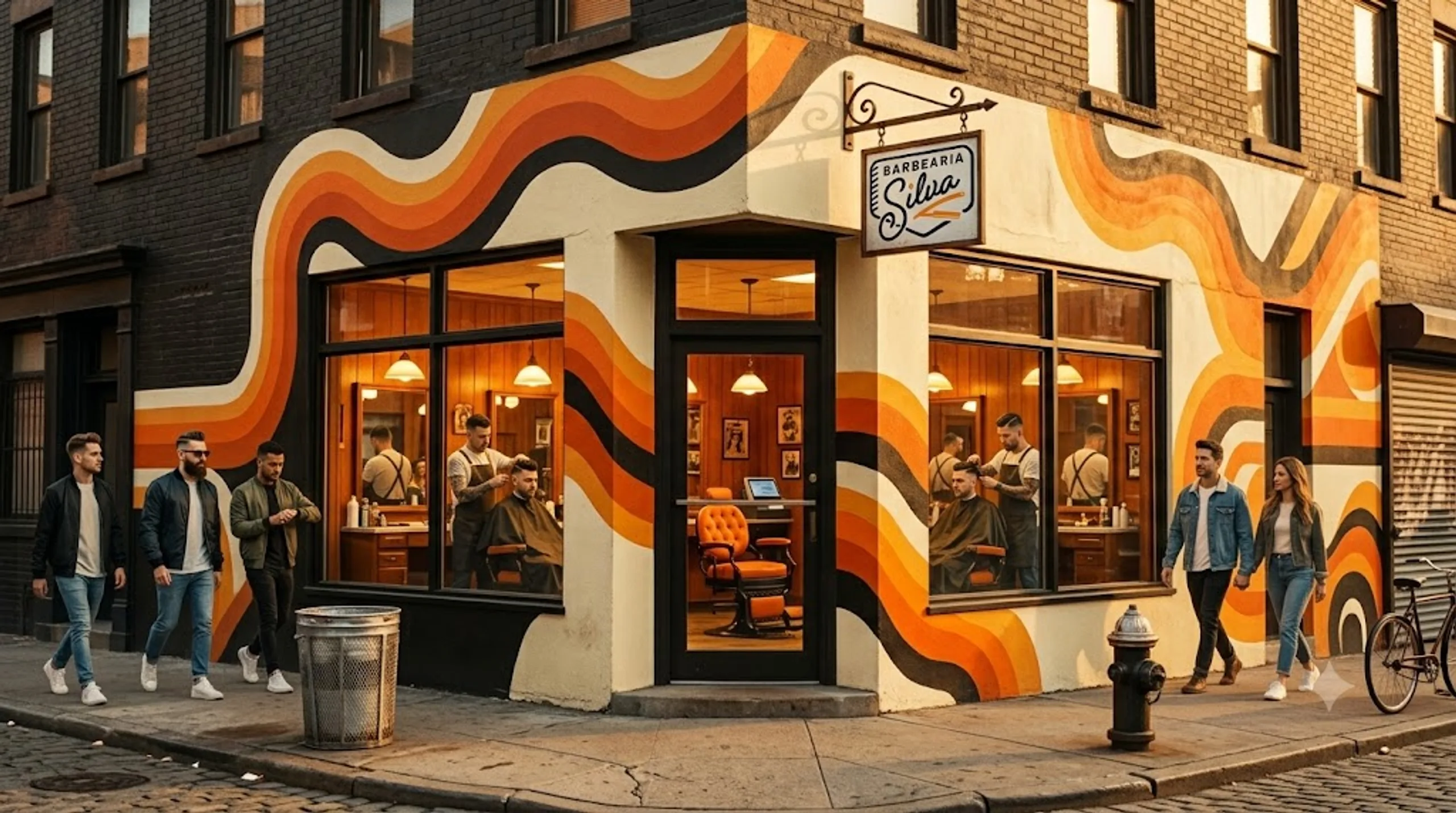
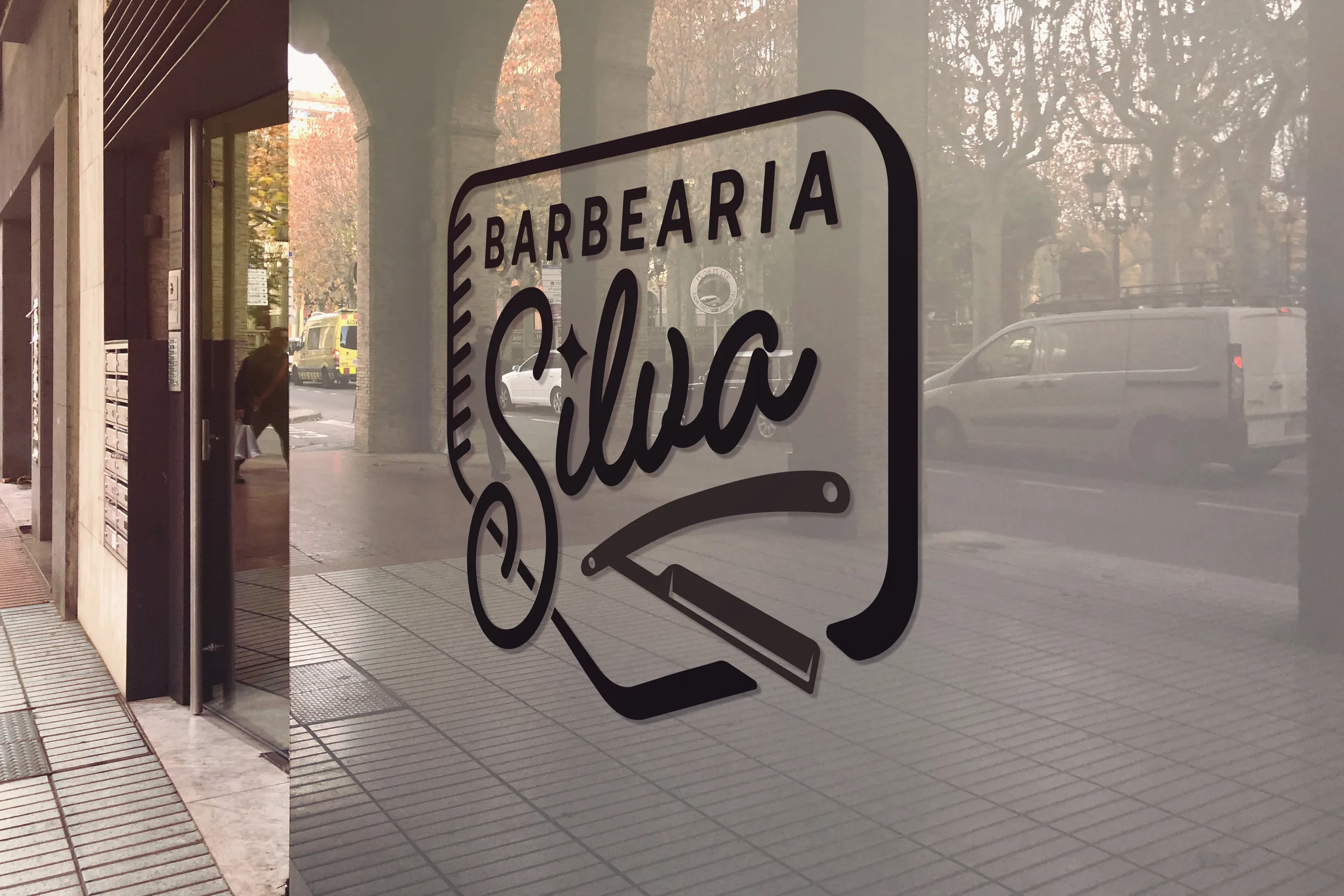
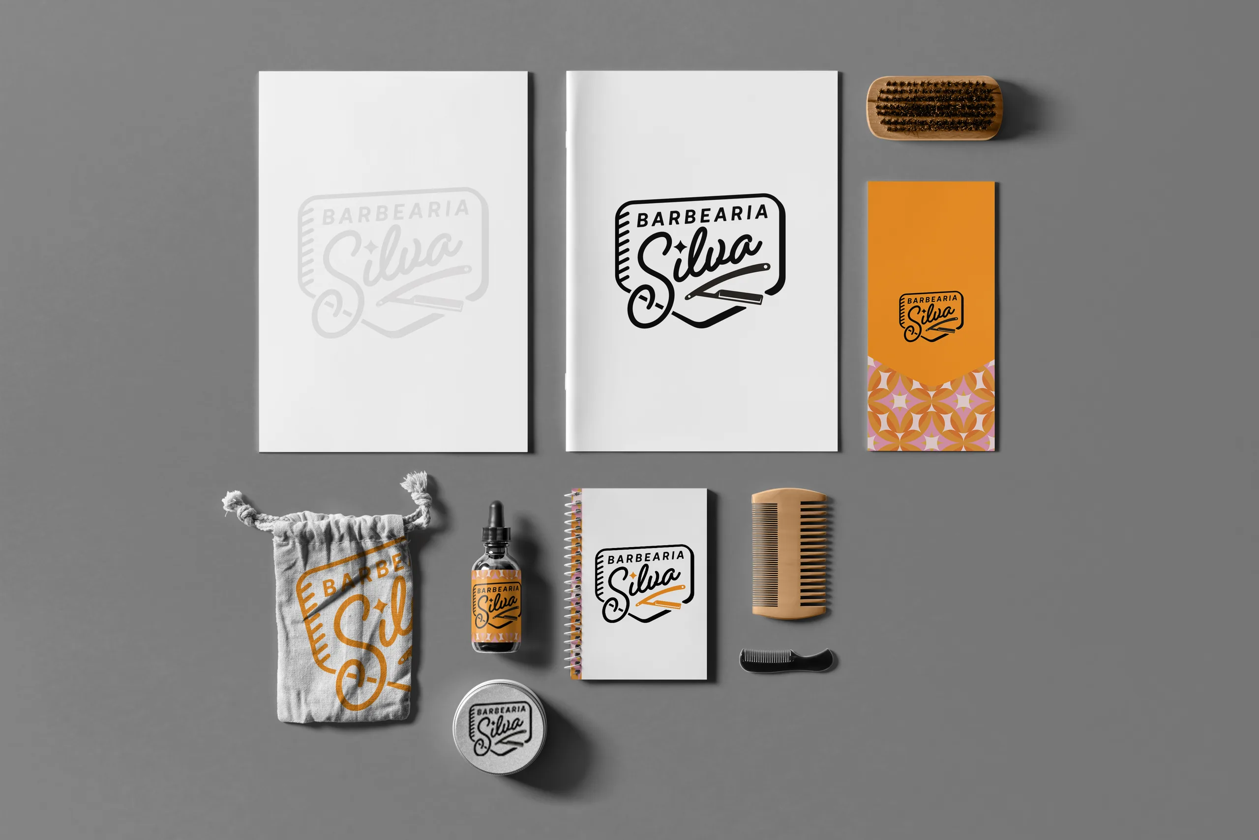
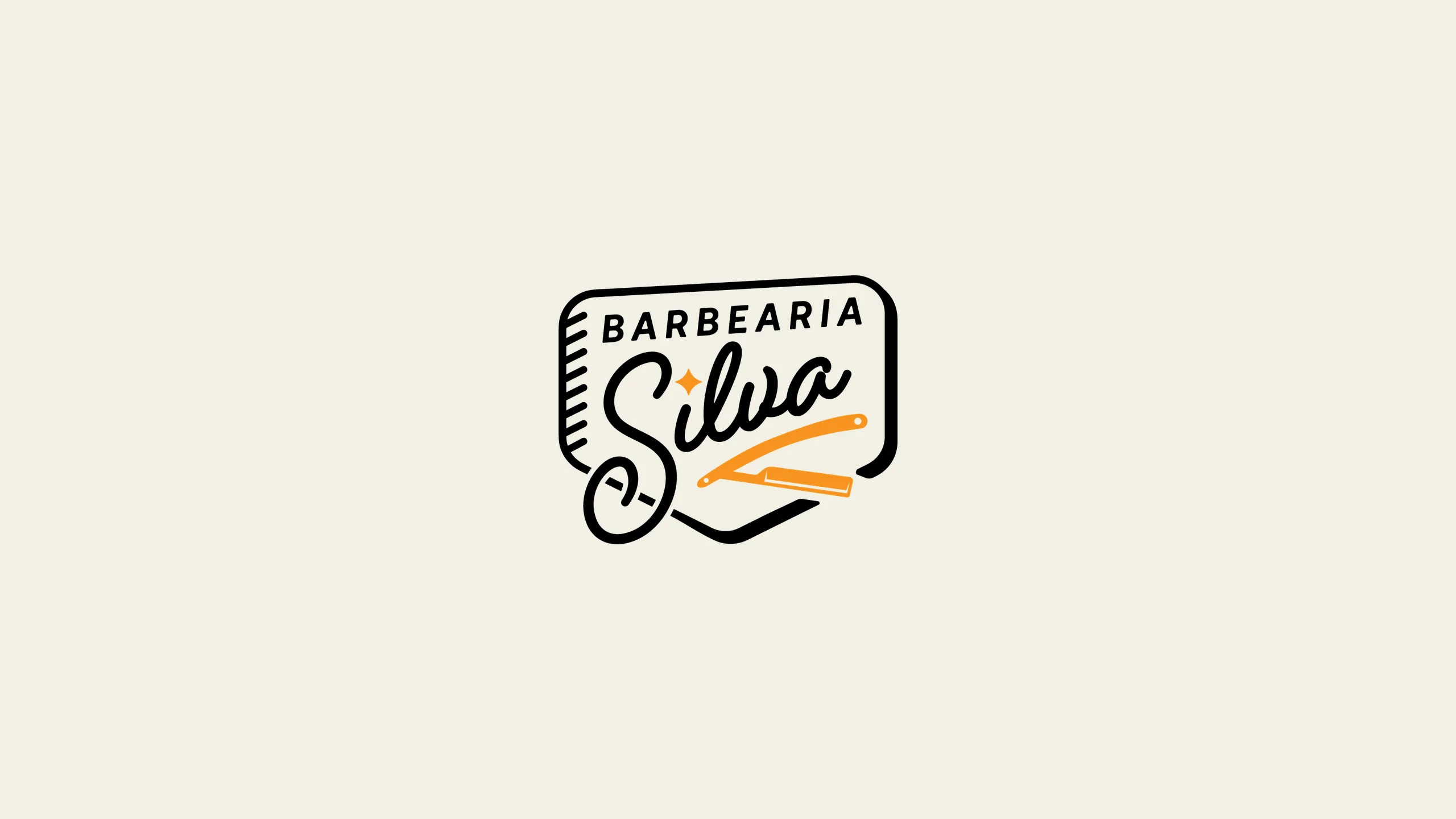
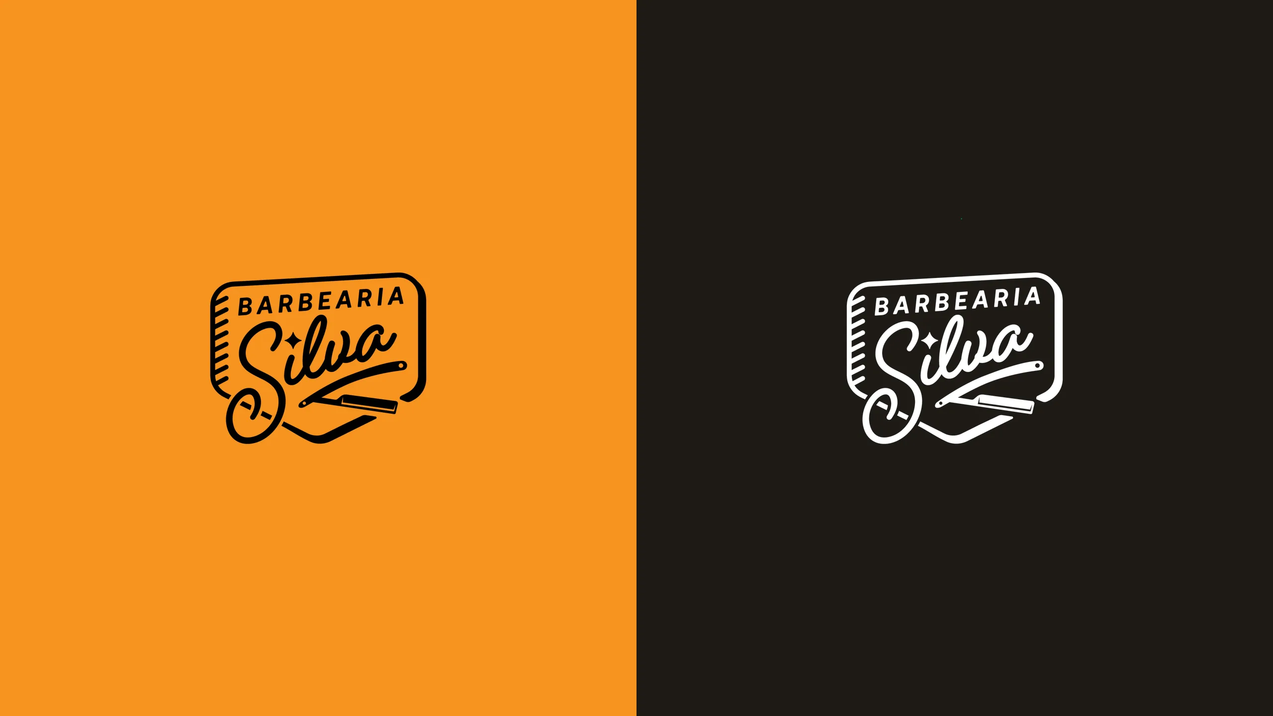
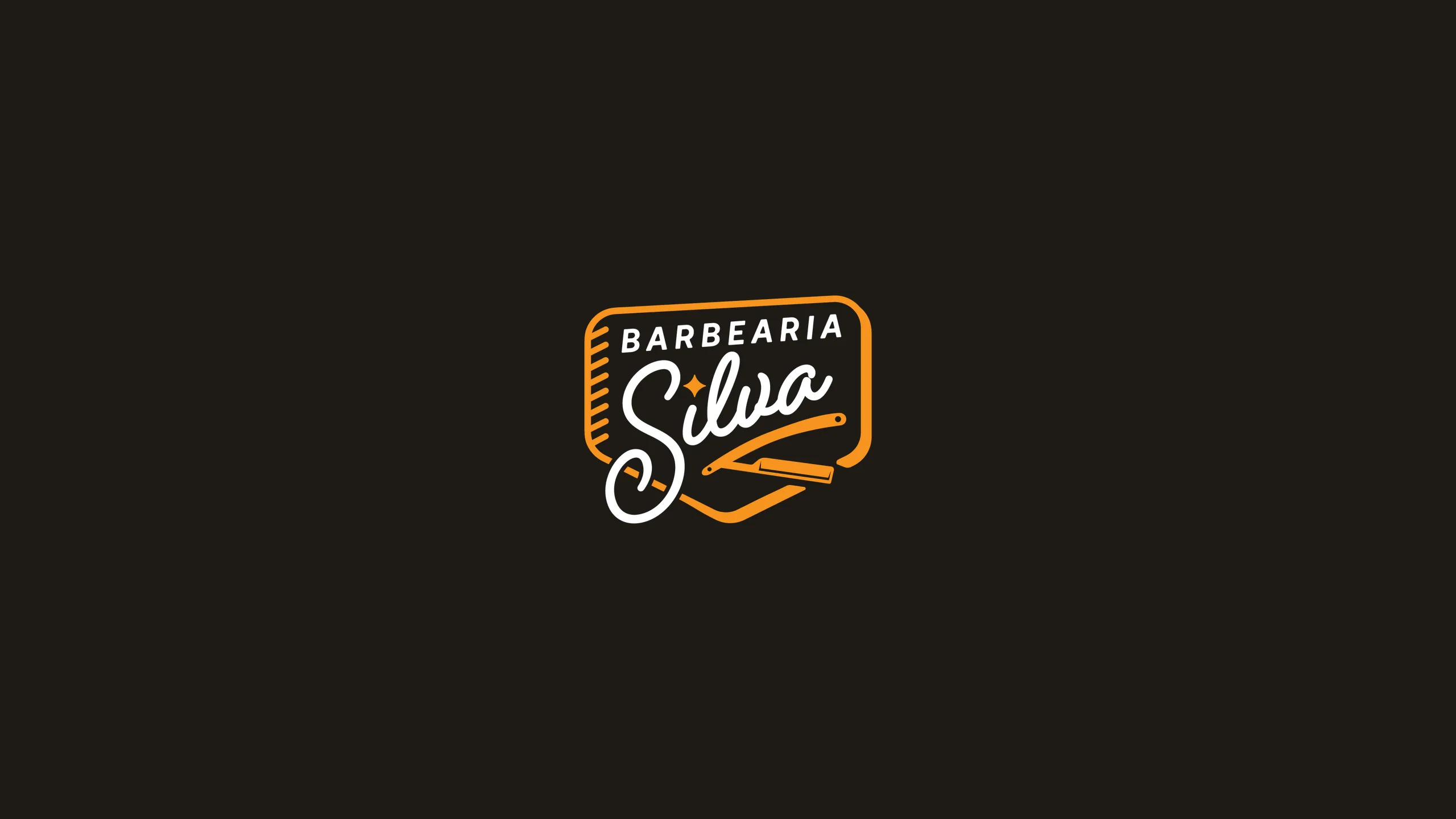
Logo construction and visual identity for Barbearia Silva. The concept draws from 70s and 80s Black retro - Brooklyn's Black culture - translated into a badge with script lettering, comb and straight razor. The palette pairs warm orange #F7931E with off-black #1E1B16, and the system covers color and monochrome versions, a graphic pattern, plus facade, storefront and product applications.
The mark
Badge with script lettering, comb and straight razor - the tools of the trade built into the mark.
Pattern
Support graphics inspired by 70s surfaces - a pattern for packaging and collateral.

Applications
The brand out in the world: corner facade with supergraphics, storefront and products.